this phase: 396 Alberta upstream and midstream operators (2023 Petrinex data)
what: identify which operators stand to benefit most from implementing carbon reduction strategies
why: rising carbon prices, regulation, and investor expectations turn emissions into a material financial exposure
how: operator level emissions and economics model on Petrinex 2023, BOE normalized intensities, Hamilton DAG pipeline designed to extend to GHGRP and NPRI
result: in the Alberta 2023 slice, about 9 Mt CO2e (around 25 percent of modeled emissions) are technically and economically addressable, worth well over 1 billion dollars per year at 2030 carbon prices
Alberta’s 2023 upstream and midstream emissions contain a 9 Mt CO2e reduction wedge that is both technically and economically attractive. Across 396 operators and about 780 million boe of production, this wedge represents roughly one quarter of modeled emissions and more than 1 billion dollars per year in avoided carbon charges at 2030 prices. A 500,000 tonne CO2e operator alone faces about 85 million dollars per year of carbon cost at 170 dollars per tonne. The only durable way to change that exposure is to change operations and investment.
This phase applies a consistent emissions and economics model to Alberta operators in 2023. It ranks operators by the financial benefit of decarbonization, based on emissions intensity, absolute scale, reduction pathways, and regulatory pressure. The pipeline is designed so that North American datasets such as GHGRP and NPRI can be added without altering the core structure, allowing the same approach to be reused at larger scale.
A follow-on 2022-2023 panel analysis uses the same machinery to look at realized behavior over time. It covers 798 operator-years (432 operators, 366 with both years). About 80 percent of these operators increased emissions as production grew, and the correlation between 2022 opportunity scores and realized 2022->2023 reductions is strongly negative (r ~ -0.73). High-opportunity operators grew emissions more because they are large and expanded output in a growth period. This validates that the scoring framework finds the right “where to look” operators, but also shows that in growth environments production dominates efficiency.
Code
investmentData =awaitFileAttachment("docs/assets/figures/top10_investment_opportunities.json").json()// Sort by NPV descending and take top 10, without mutating originalinvestmentSorted = [...investmentData].sort((a, b) => b.npv_mm- a.npv_mm).slice(0,10)// Explicit y-domain so bars appear in sorted order, top at bottom (like PNG)investmentYDomain = investmentSorted.map(d => d.operator_name).toReversed()validere.plot([ Plot.barX(investmentSorted, {x:"npv_mm",y:"operator_name",fill:"investment_score",// nice wide barssort: {y:"x",reverse:true},title: d =>`${d.operator_name}\nNPV: $${d.npv_mm.toFixed(1)}M\nPayback: ${d.payback_years.toFixed(2)} years\nReduction: ${d.reduction_potential_kt.toFixed(1)} kt\nInvestment Score: ${d.investment_score.toFixed(1)}` }),// Put label at the right edge of the bar; if bar is short, it will still be visible. Plot.text(investmentSorted, {x: d => d.npv_mm,y:"operator_name",dx:-6,text: d =>`$${d.npv_mm.toFixed(0)}M`,fill: validere.colors.offWhite,fontSize:11,fontWeight:"bold",textAnchor:"end" })], {marginLeft:220,// more room for long operator namesx: {label:"NPV (Million $)"},y: {label:null,domain: investmentYDomain},color: {type:"linear",range: [validere.colors.lightTeal, validere.colors.darkerTeal],label:"Investment Score"},width:900,height:500})
(a)
(b)
(c)
(d)
Figure 1: Top 10 operators ranked by investment opportunity, showing NPV, payback period, and reduction potential.
WarningScope note
Intensities in this phase are calculated from 2023 Petrinex reported operational emissions and production. They do not cover full lifecycle well to battery CO2 per boe. The focus is on emissions directly controlled by the operator. The 2022-2023 panel is used for descriptive validation and behavioral insight, not for production forecasting.
Context and objectives
The objective is to turn a vague North American decarbonization question into a concrete, data driven answer that can drive capital decisions. The brief is deliberately open ended: frame the problem, make defensible assumptions, build a solution using data and code, and connect it back to business value. The choice to start with Alberta 2023 reflects a tradeoff: depth and reliability in one jurisdiction before breadth.
Alberta is a good proving ground for three reasons:
it concentrates a large share of Canadian upstream production and oil sands output
it has a mix of asset types, including some of the highest intensity operations
Petrinex provides integrated facility month data for production, activities, and infrastructure
This allows a single pipeline to ingest raw data, build a medallion stack, and produce operator level metrics. The intent is not to stop at Alberta, but to ensure that the machinery is robust before it is pointed at a wider North American universe.
In this framing, an operator “benefits” from carbon reduction when it can reduce a material, policy driven cost using technologies that fit its asset base and capital cycle. Four factors matter:
emissions_intensity:
higher intensity than peers signals an efficiency gap
absolute_scale:
medium to high emissions ensure that reductions are financially meaningful
reduction_pathways:
proven technologies with short or moderate paybacks make projects fundable
external_pressure:
carbon prices, benchmarks, thresholds, and investor expectations create urgency
Operators where these four align are prioritized in the rankings and in the business discussion.
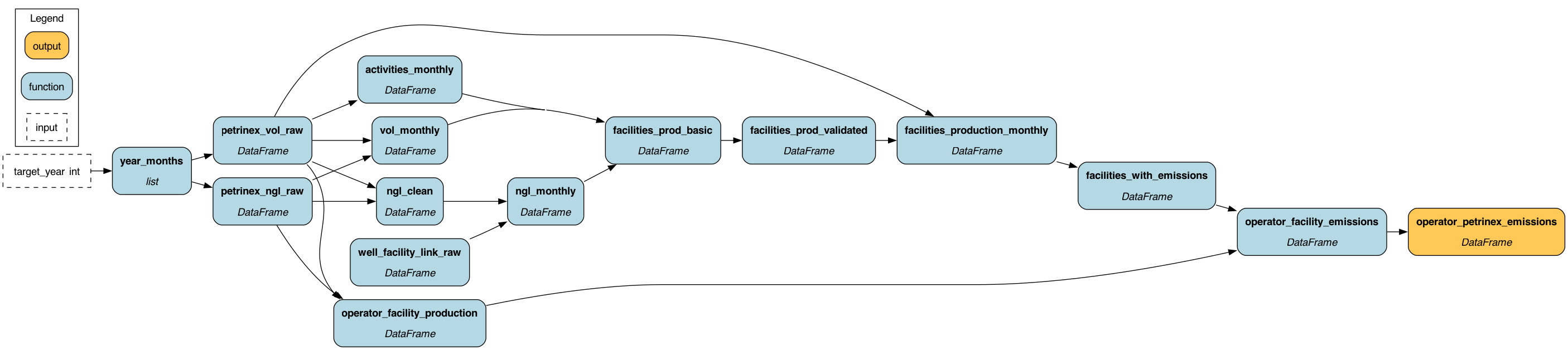
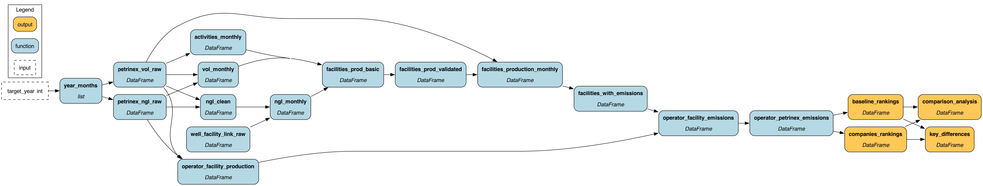
Data and pipeline
The data pipeline is a Hamilton based medallion stack that turns raw Petrinex tables into operator level decision metrics. It is structured to be simple to rerun and simple to extend.
Data flow:
graph LR
  P[Petrinex API] --> B[Bronze<br/>Raw parquet]
  B --> S[Silver<br/>Cleaned Facility Production]
  S --> G[Gold<br/>Emissions and Metrics]
  G --> A[Analysis<br/>Scenarios and Risk]
  A --> V[Viz<br/>Figures and Exports]
Scope and coverage:
geography:
Alberta only, via Petrinex
period:
January to December 2023 for the main ranking slice
2022-2023 for the validation panel
coverage (2023 slice):
about 780 million boe of production
396 operators
around 2,800 facilities
approximately 98 percent of volumes mapped to operators
coverage (2022-2023 panel):
798 operator-years
432 unique operators
366 operators present in both years (used for realized reduction analysis)
Layer responsibilities:
bronze:
read raw Petrinex volumetric, NGL, and infrastructure files
write partitioned parquet under data/bronze
silver:
build facility month production and activity fact tables
compute NGL production and facility flow edges
maintain a facility dimension with SCD2 history and operator BAID
gold:
compute facility level emissions and intensity
aggregate to operator year emissions and intensities
calculate operator level decision metrics and views for visualization
analysis:
run scenario, clustering, and risk modules on Gold outputs
construct a multi-year operator panel for validation and ML experiments
viz:
produce PNG figures and tables from standardized views
include a descriptive “opportunity vs realized reduction” scatter from the 2022-2023 panel
Keys and grains:
facility_id:
derived from ReportingFacilityID and related fields
operator_baid and operator_name:
derived from Business Associate IDs and names
time:
production_month as a date, plus derived year and month
grains:
silver: facility_id x production_month
gold facility: facility_id x production_month
gold operator: operator_baid x year
panel: operator_baid x year across 2022-2023
The same keys will be used when GHGRP and NPRI are added, allowing new data sources to slot into the same pipeline.
Panel view and realized reductions (2022-2023)
In addition to the 2023 cross section, the pipeline builds an operator-year panel for 2022-2023. This panel is used to measure realized behavior, not just modeled potential.
Panel construction:
base:
operator level emissions and decision metrics for 2022 and 2023
panel:
stack both years into a single (operator_baid, year) table
about 45 percent improved emissions intensity, but production growth swamped those gains in absolute terms
correlation between 2022 opportunity_score and realized_reduction_t is about -0.73
high-opportunity operators increased emissions more in this growth period
they are large oil sands and large portfolio players expanding production
The pipeline also maintains an offline ML path that can train panel-based models on this dataset. Training happens in separate scripts that write predictions and diagnostics to parquet and JSON. The Hamilton DAG then optionally loads those predictions through a single node and degrades gracefully when they are absent. In this report, all findings are based on descriptive statistics and correlations, not on ML forecasts.
Emissions model and metrics
Emissions are calculated bottom up from facility activities into eight components, normalized by production, and then aggregated to the operator level. The model is transparent and uses factors that are explicit in code.
Facility level:
inputs per facility_month:
production: gas, oil, condensate, water
gas activities: FLARE, VENT, FUEL volumes for gas
throughput: gas volumes produced and received
drivers: NGL mix and steam volumes where applicable
extreme values clipped for plotting; original intensity and clip flags kept for analysis
Operator level:
group facility_aggregated by operator_baid and year
sum emissions and total_boe
recompute intensity_kg_per_boe from aggregated values
Core parameters used in the model include:
CH4 global warming potential:
28 x CO2 on a 100 year basis (IPCC AR5)
discount rate:
10 percent for NPV calculations
carbon price path:
about 65 dollars per tonne in 2023, rising to 170 dollars per tonne in 2030
Decision metrics derived per operator_year:
npv_mm:
NPV of modeled reduction projects given the discount rate and price path
reduction_potential_kt:
addressable emissions in kilotonnes based on source mix and assumed abatement fractions
regulatory_risk_score:
composite of emissions scale, intensity, and venting/flaring relative to thresholds
payback_years:
simple payback = CAPEX / annual savings
Composite scores:
investment_score:
based on the ratio of NPV to CAPEX, normalized to a 0-100 range
benefit_score:
uses a four part weighting:
intensity contribution: 35 percent
scale contribution: 25 percent
financial contribution: 30 percent
regulatory contribution: 10 percent
opportunity_score:
used in a subset of decision views with a 40 / 40 / 20 weighting for opportunity size, economics, and regulatory pressure
The 2022-2023 panel reuses these same metrics and scores. The realized reduction analysis then asks a behavioral question: given these scores in 2022, which operators actually reduced emissions in 2023, and which increased them?
Clustering and operator archetypes
Segmentation uses features that capture both emissions scale and emissions structure, not size alone. The goal is to group operators into intuitive archetypes that share similar profiles and levers.
Features used for clustering include:
production_boe
intensity_kgco2e_per_boe
gas_pct
flare_rate
vent_rate
flare_share
water_cut
ngl_intensity
facility_count
These features are standardized and fed into a K means algorithm with an adaptive choice of cluster count. From the resulting centroids, rule based labels are assigned, such as:
high_intensity_sagd
large_sagd_producer
multi_facility_conventional
high_venting_conventional
large_gas_producer
portfolio_operator
thermal_heavy_oil
growth_stage_operator
Representative metrics for these archetypes are:
archetype
emissions_kt
intensity_kg_per_boe
benefit_score
npv_mm
payback_years
addressable_pct
high_intensity_sagd
450
70-90
88
65
3.2
35
large_sagd_producer
380
70-80
82
52
3.8
32
multi_facility_conventional
220
30-40
79
38
2.9
42
high_venting_conventional
185
40-50
81
28
2.4
51
large_gas_producer
160
20-30
71
22
4.2
28
portfolio_operator
145
30-40
76
19
3.5
38
thermal_heavy_oil
125
60-70
74
16
4.8
29
growth_stage_operator
95
35-45
68
12
3.1
44
Patterns:
high_intensity_sagd and large_sagd_producer:
high intensity and high scale
carbon costs in the tens of millions per year per operator at 2030 prices
main levers: steam and power (cogeneration, steam optimization, waste heat recovery)
multi_facility_conventional and high_venting_conventional:
moderate to high intensity across many facilities
main levers: standardized vent, flare, and fuel programs
growth_stage_operator:
mid sized and growing, often near thresholds
main levers: intensity management, sequencing of projects and growth
For high venting clusters, venting and flaring account for a large share of emissions:
sector level:
vent and flare total around 10-15 percent of modeled emissions
high vent clusters:
vent and flare can account for 30-50 percent of emissions
Venting and flaring projects typically sit in the 60-140 dollars per tonne MAC range, with paybacks around 2-3 years. A typical VRU project on a 5 MMcf/d stream has a payback of roughly 1.5-2 years and a positive NPV at current price paths.
Risk, policy, and scenarios
Most of the value in this analysis is driven by policy and price, not sentiment, so scenarios around carbon and regulation are central. The model treats the policy environment explicitly.
Carbon price base path:
around 65 dollars per tonne in 2023
around 170 dollars per tonne by 2030
Under this path, a 300 kt/year operator faces gross carbon charges growing from roughly 20 million dollars per year to 50 million dollars per year. Alberta’s TIER regime defines how much of this manifests as net cost versus credit generation.
Thresholds and benchmarks:
below 100 kt:
lighter regime; reporting and compliance are limited
between 100 and 500 kt:
mandatory reporting and credit obligations
above 500 kt:
larger compliance footprint and higher scrutiny
illustrative benchmark paths:
conventional: mid 30s kg/boe trending to mid 20s
SAGD: high 70s trending to low 60s
gas: high teens trending to mid teens
Scenario set:
baseline:
current carbon price path and regulatory pressure
accelerated:
steeper price path and stronger enforcement
delayed:
softer price path and slower implementation
regulatory_shock:
baseline price path plus additional compliance cost and higher pressure
For each scenario, the model recomputes NPV, MAC, payback, and composite scores, then re ranks operators. Operators that retain high ranks across scenarios are robust targets. Operators whose position improves mainly under higher prices or stronger regulation are more speculative.
A risk return scatter uses npv_mm and regulatory_risk_score, with bubble size scaled by total emissions and color by investment_score. It highlights:
high_value_low_risk:
obvious early candidates
high_value_high_risk:
high potential but sensitive to policy or execution
low_value_low_risk:
opportunistic
low_value_high_risk:
low priority
Additional penalties for data quality, model uncertainty, and operational concentration adjust scores to reflect execution risk. The same scenario and risk logic can be applied once GHGRP and NPRI data are wired in.
Behavioral evidence from the 2022-2023 panel
The 2022-2023 panel links the scoring framework back to actual operator behavior. It does not change the 2023 ranking slice, but it sharpens how to use those rankings.
Key observations:
366 operators have both 2022 and 2023 data
about 80 percent increased emissions in absolute terms
about 20 percent reduced emissions
roughly 45 percent improved intensity, but production growth dominated absolute outcomes
correlation between 2022 opportunity_score and realized_reduction_t is about -0.73
high-opportunity operators increased emissions more during this growth period
they grew production faster and from a higher base
Within this panel three behavioral segments show up clearly:
prime_targets:
high opportunity scores and actual reductions
skew to gas storage, midstream, and gas-heavy operators
proof points that large-scale reduction is achievable where assets and timing line up
hidden_gems:
low to mid opportunity scores but actual reductions
mainly smaller operators
may indicate low cost operational moves, divestments, or flexible field programs
all_talk_majors:
very high opportunity scores and very large emission increases
large oil sands and portfolio operators who grew 30-140 percent in production
they dominate the increase in absolute emissions over 2022-2023
The conclusion is simple:
the physics- and economics-based scoring framework correctly points at the big, inefficient operators
in a growth environment those same operators will often increase absolute emissions unless growth is explicitly constrained
behavioral evidence from the panel should be used to shape how engagement is framed:
majors: intensity and project portfolios, not “absolute 2030 cuts” in isolation
prime_targets and hidden_gems: early case studies and commercial wins
Any ML models trained on this panel are treated as exploratory. They run offline, write predictions and feature importance to parquet, and are loaded into the DAG only when needed. The descriptive panel and simple correlations already provide a strong reality check on the scoring logic.
Business implications and next steps
The analysis shows that decarbonization is a concentrated opportunity: a few operator types and a few emissions sources drive most of the value. In Alberta 2023, roughly 36 Mt CO2e of upstream and midstream emissions include about 9 Mt of addressable reductions. At 2030 prices, this wedge is worth over 1 billion dollars per year before fuel savings and recovered gas.
The 2022-2023 panel adds one important nuance: most of the recent emission increases came from a small set of large oil sands and portfolio operators who expanded production. At the same time, a mix of gas storage, midstream, and smaller conventional operators actually reduced emissions. These are natural early proof points, even if the strategic prize sits with the majors.
Priority operator profiles:
high_intensity_thermal:
large SAGD and thermal heavy oil operators
main levers: steam and power projects that reduce 20-30 percent of emissions on positive economics
large_conventional_portfolios:
multi facility conventional operators
main levers: standardized vent, flare, and fuel programs with short paybacks
growth_stage_near_threshold:
mid sized operators close to thresholds
main levers: design and timing of projects to influence benchmark and threshold outcomes
prime_targets and hidden_gems from the panel:
operators that already reduced between 2022 and 2023
main levers: scale what worked, codify patterns into repeatable playbooks
Recommended actions for a decarbonization partner:
target high vent and high flare sites first:
use venting_reduction_potential_kt and flaring_reduction_potential_kt to build a ranked facility list
propose VRUs, flare gas recovery, and simple fuel efficiency projects with paybacks under three years
use intensity as the anchor metric in discussions:
show where each operator sits versus peer quartiles
translate intensity gaps into implied carbon costs at 2030 prices
frame programs as portfolios:
assemble sequences of small, fast projects and larger, strategic ones
show how early wins can fund or de risk later stages
connect to thresholds and credits:
quantify how projects alter reporting status and credit positions
for efficient operators, highlight the potential to move into net credit generation
use panel evidence to set expectations:
with growth, absolute emissions will often rise even as intensity improves
focus conversations with majors on “intensity plus growth guardrails” rather than pure absolute targets in isolation
Interactive Visualizations
The following interactive visualizations allow you to explore the data in detail. Hover over points to see operator names and key metrics, and use the interactive features to filter and examine the data.
Code
import {Plot} from"@observablehq/plot";validere = {const colors = {teal:'#2DAAAF',dark:'#304754',lightTeal:'#CEF1F3',darkGray:'#1D2C34',offWhite:'#F7FDFD',// Semantic colorssuccess:'#2DAAAF',// Teal for positive/reductionswarning:'#FFD166',// Yellow for warningsdanger:'#304754',// Dark for increases/high risk// Extended palettedarkerTeal:'#1A8A8F',lighterDark:'#4A5A6A',mediumLightTeal:'#9DD1D5' };const palette = [colors.teal, colors.dark, colors.lightTeal, colors.darkGray, colors.offWhite];const defaultOptions = {marginLeft:60,marginBottom:40,marginTop:20,marginRight:20,style: {background:'white',fontSize:'11px',fontFamily:'Verdana, Arial, DejaVu Sans, sans-serif',color: colors.dark },grid:true,nice:true,// Default axis stylingx: {labelFontSize:12,tickFontSize:10 },y: {labelFontSize:12,tickFontSize:10 } };return { colors, palette, defaultOptions,// Helper function to create themed plotsplot: (marks, options = {}) => {const plotOptions = {...defaultOptions,...options, marks };// Handle color configurationif (options.color===null|| options.color===undefined) {// If explicitly set to null, don't set color (for function-based fills)delete plotOptions.color; } elseif (options.color) {// Merge with default palette if color config provided plotOptions.color= { range: palette,...options.color }; } else {// Default: use palette plotOptions.color= { range: palette }; }return Plot.plot(plotOptions); } };}
Figure 2: Comparison of opportunity scores against realized emissions reductions (2022->2023). Operators above the zero line reduced emissions; those below increased emissions.
Figure 4: Risk-return analysis showing NPV vs regulatory risk score. Bubble size represents total emissions. Operators in the upper left (high NPV, low risk) are prime targets.
Figure 5: Production volume vs emissions intensity. Operators are colored by archetype to show different operational profiles.
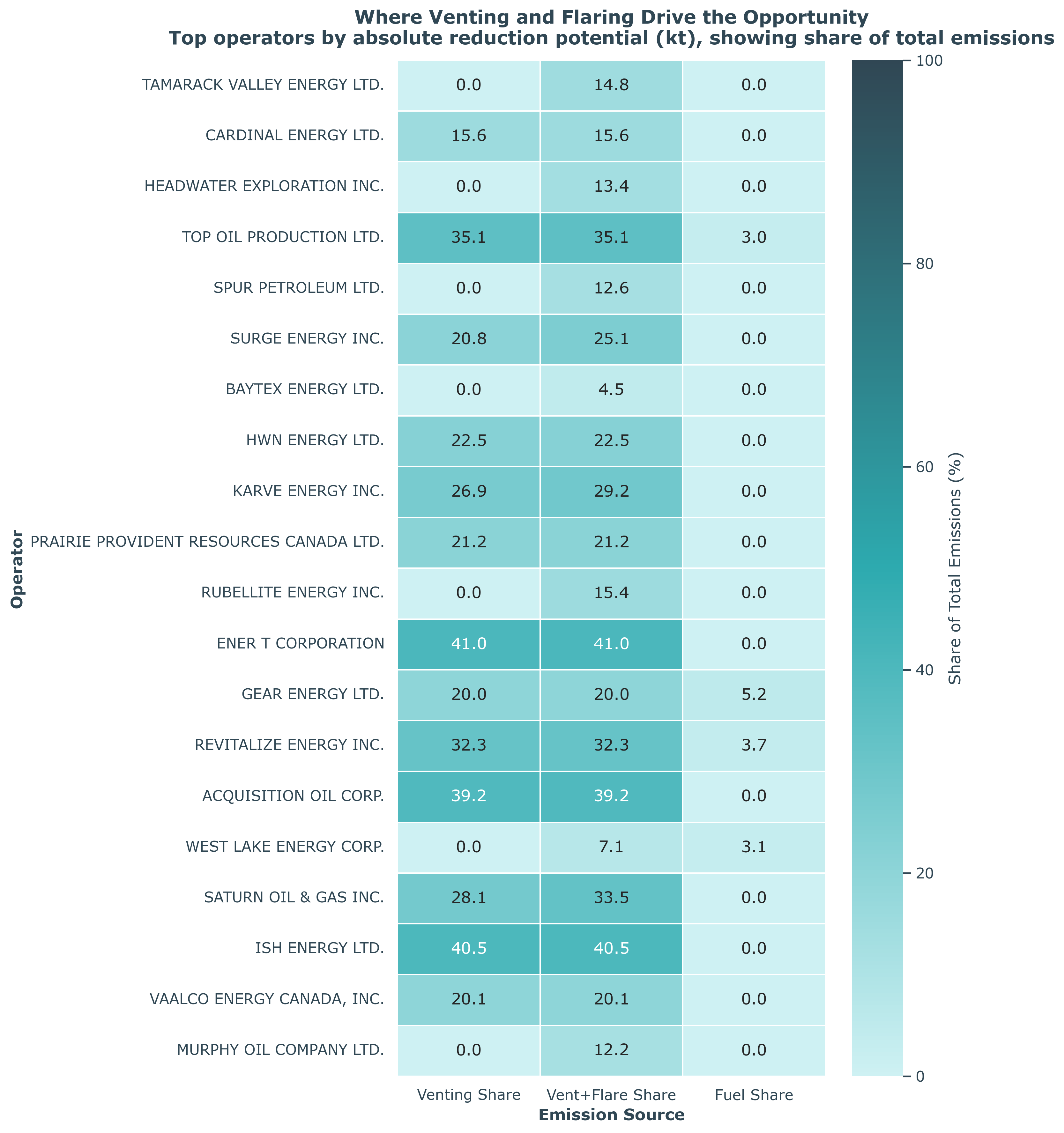
Figure 6: Top 20 operators ranked by venting and flaring reduction opportunities. Color intensity represents total reduction potential.
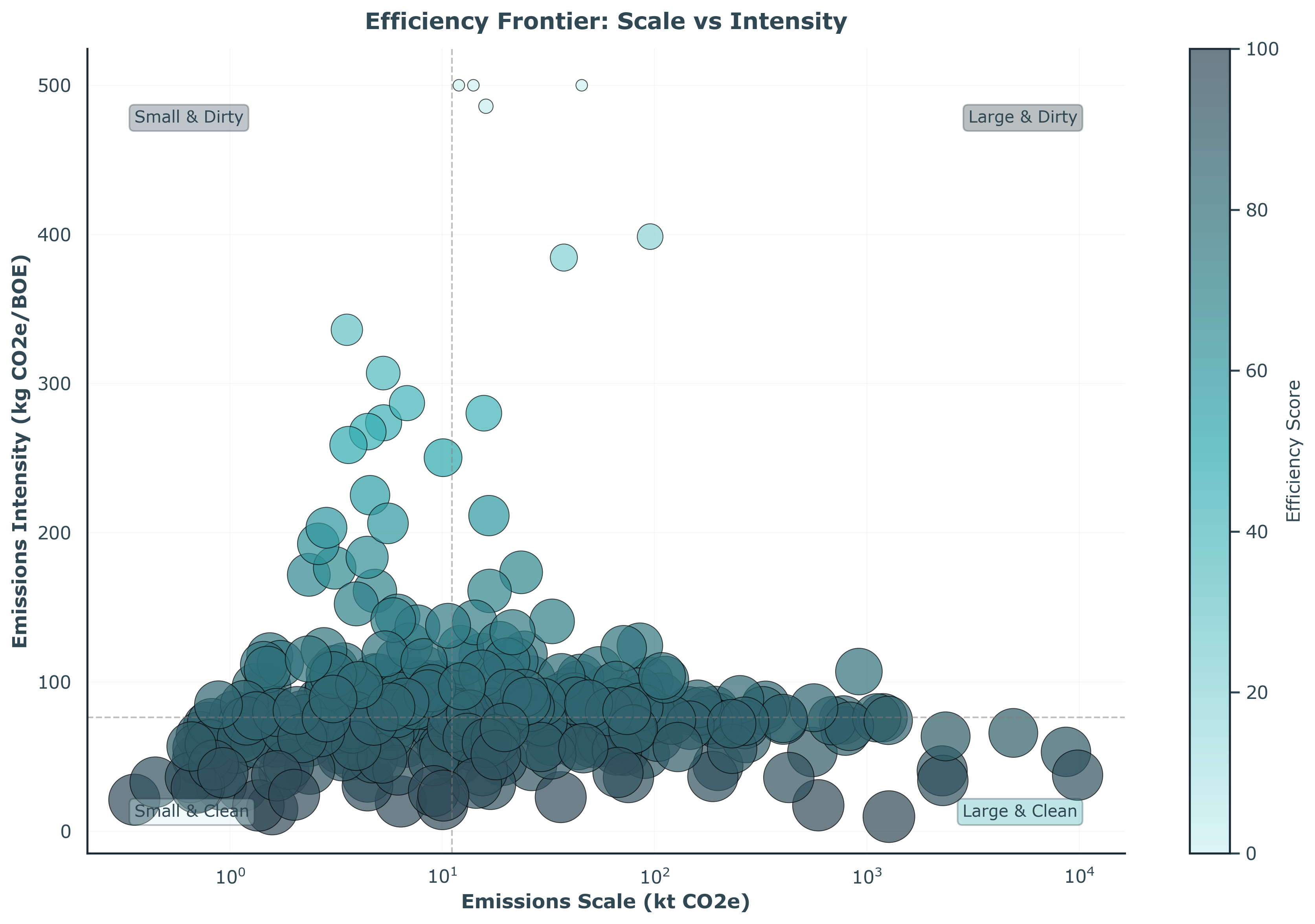
Figure 7: Production vs emissions intensity efficiency frontier. Operators in the lower right (high production, low intensity) are most efficient.
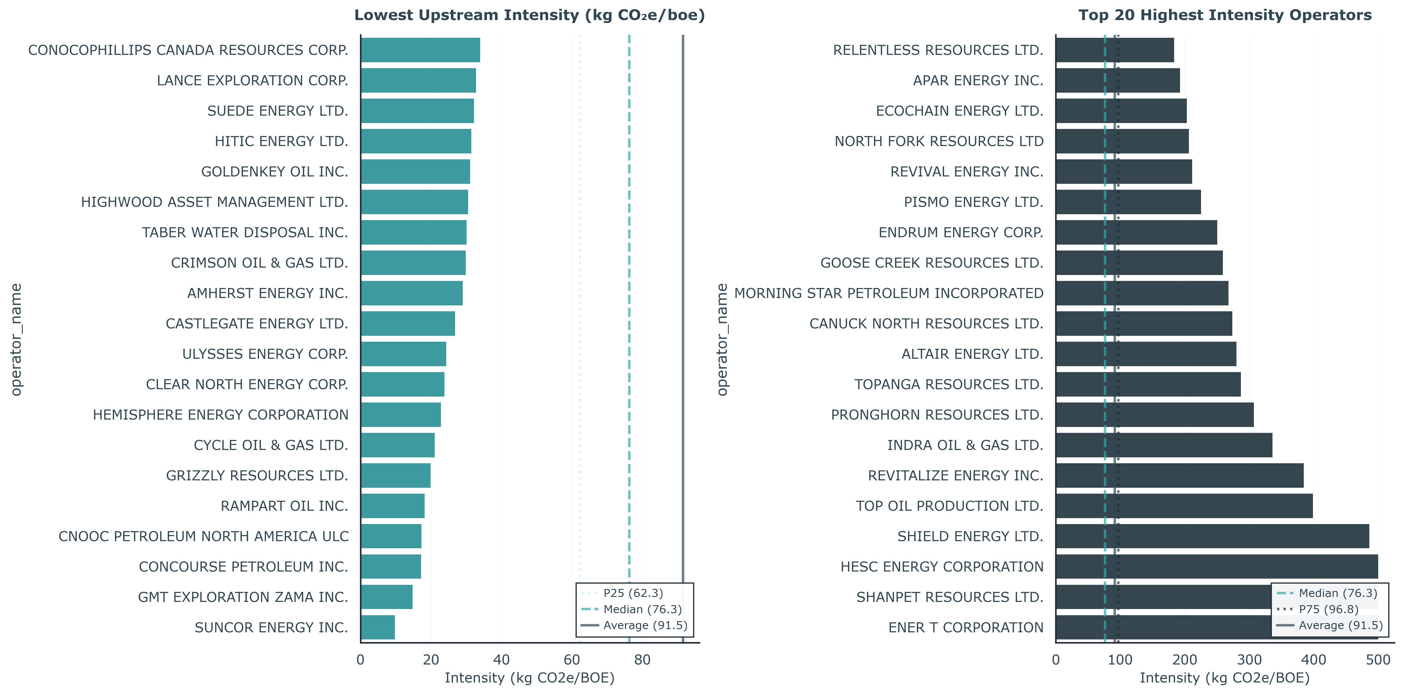
Figure 8: Operators ranked by emissions intensity (lowest to highest). Lower intensity indicates better efficiency.
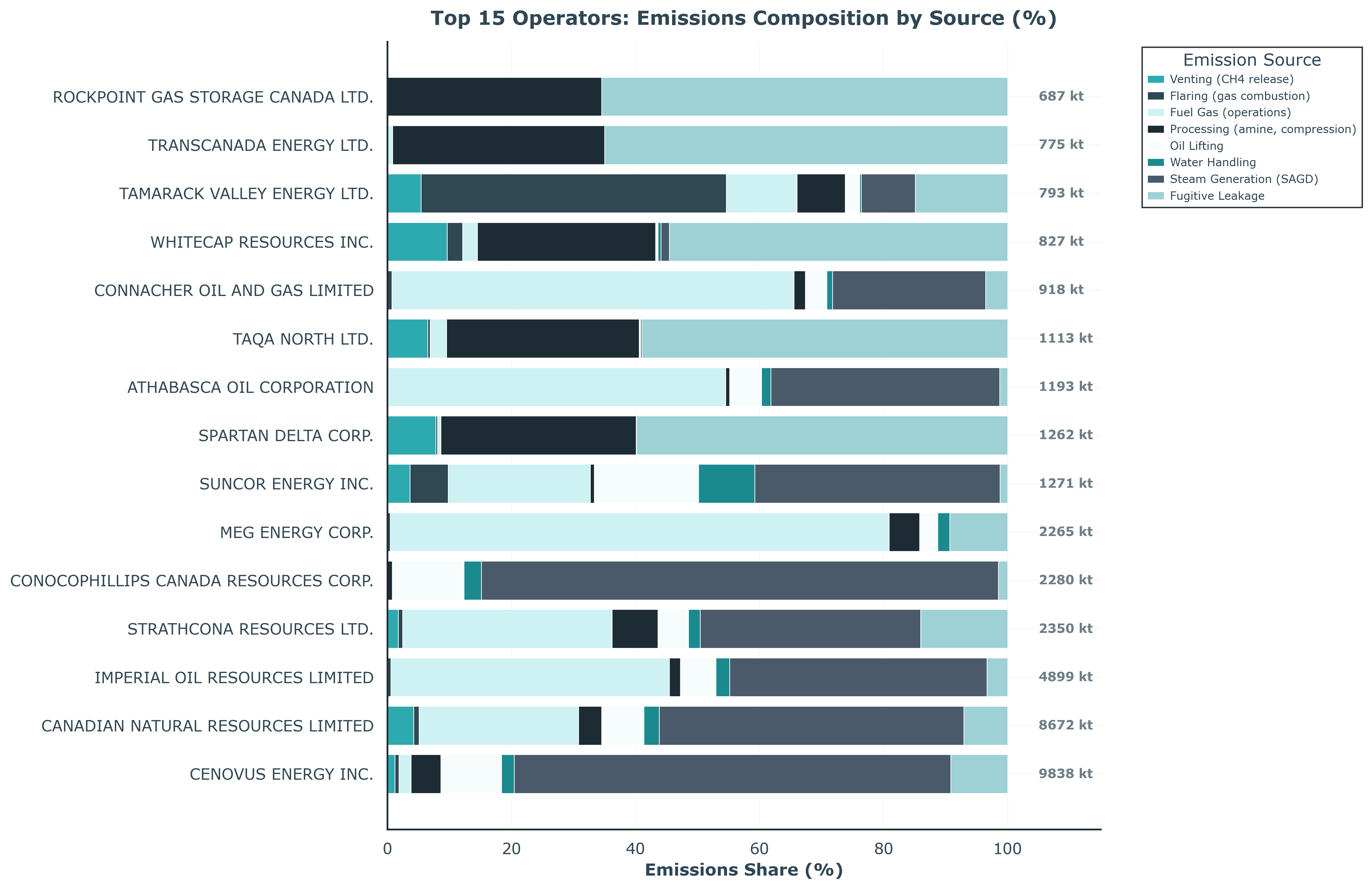
Figure 9: Stacked decomposition of emissions by source for top operators. Shows the relative contribution of venting, flaring, fuel, processing, and other sources.
From a development point of view, this phase demonstrates that the Hamilton + medallion pipeline, emissions model, decision metrics, and 2-year panel cohere and can be run end to end on real data. The natural next step is to attach additional years and jurisdictions and let the same machinery answer the original North American question at full scale. More years will also turn the current exploratory ML work into a robust forecasting layer that can sit on top of the physics-based core, rather than replace it.
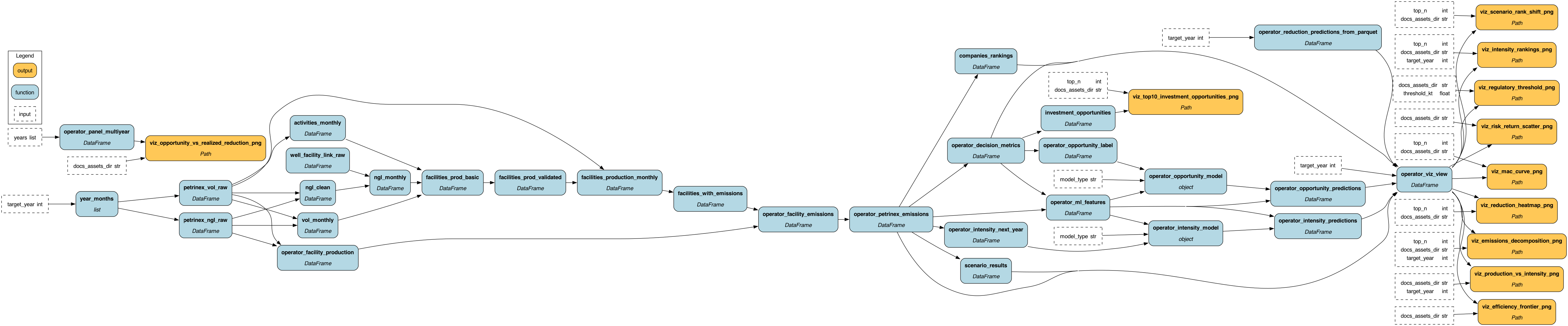
Pipeline architecture at a glance
Note
This section shows the core DAG layers that drive the analysis pipeline: 1. Viz layer (top): Decision outputs including rankings, scenarios, and visualizations 2. Gold emissions (bottom left): Facility emissions → operator-level emissions 3. Gold rankings (bottom right): Baseline rankings, composite scoring, and comparison logic